


- Design
NEW LAUNCHES FOR 2026
We have multiple supplier collections launching ahead of the new year that we are excited to share with you:
In the architecture and interior-design market, large format porcelain stoneware slabs and tiles have become key tools for expression: not only durability and finish, but also narrative — material story-telling, tactility, sustainability. To name just two Italian “houses” that stand out for their new launches in 2025-26: Florim and Mirage.
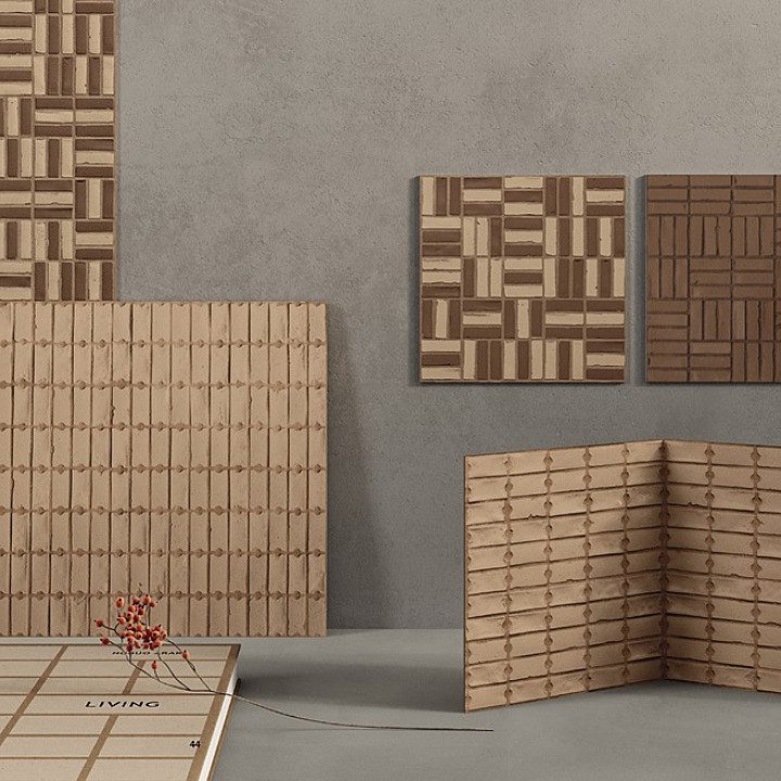
1. FLORIM – SensiTerre
Designer / Collaboration: Matteo Thun & Partners, with designer Benedetto Fasciana.
Concept & Materiality:
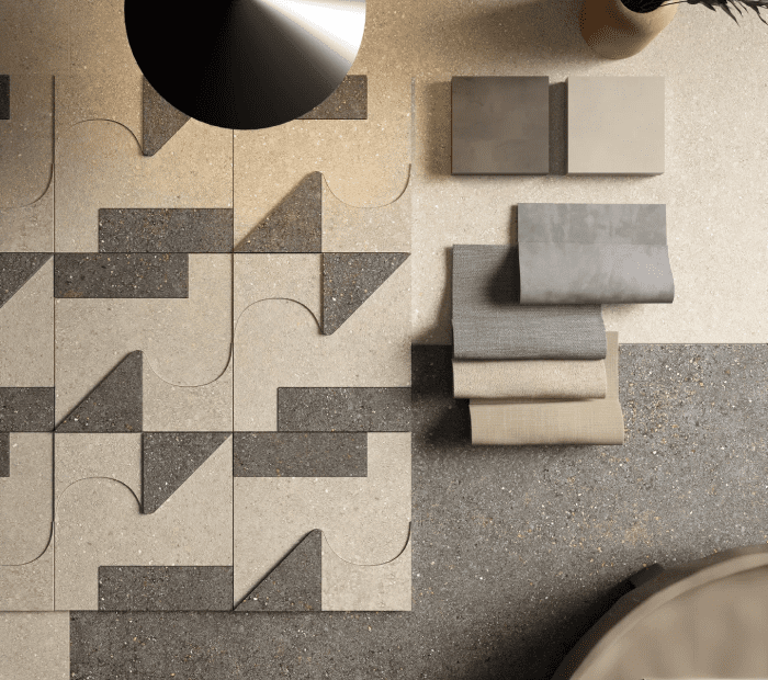
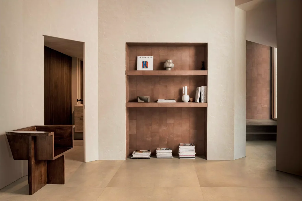
- SensiTerre is a reinterpretation of the world of clays, merging artisanal tradition with industrial innovation, curating rich, earthy tones.
- The material palette is rooted in warm, earthy tones (Cotone, Sabbia, Rosato, Mattone, Amaranto, Carbone) and textured surfaces shaped via antique working techniques (gauze imprinting, comb marks) to evoke handmade terracotta and clay artefacts.
- The collection emphasises tactility (“to be touched with the eyes and caressed with the fingers”).
Sustainability & Innovation: - It is part of FLORIM’s CarbonZero programme.
- Production approach blends "hand-made" inspiration with Industry 4.0 methods.
Why it matters for 2026? - Shows how ceramic surfaces are not just about “marble look” but telling a material story: clay, memory, texture.
- This collection emphasises surface nuance, texture and colour choice that can underpin interior schemes.
Applications: - Floors & walls indoors, even outdoor with thicker formats (20mm).
- Excellent match for architecture where the surface itself is part of the narrative — e.g., hospitality, boutique projects, premium residential.
2. FLORIM – SensiColore
Collection: SensiColore (by Florim)
Designer / Collaboration: Matteo Thun & Partners.
Concept & Materiality:
- The ‘colour’-focused extension of the Sensi family: exploring landscapes of Italy, material light + colour.
- While texture remains important, the focus shifts toward palette richness and chromatic variation rather than simply neutral earthy tones.
Why it matters: - A timely reminder that colour in surface design remains a strong differentiator, even in a market trending towards minimalism.
Applications: - Walls in retail, feature walls, accent zones in hospitality where colour can act as a backdrop or highlight.
3. FLORIM – Iconic Life
Collection: Florim Iconic Life
Concept & Materiality:
- Iconic Life is positioned as “beauty icon and refined” — rich in veining, inspired by quartzites and natural mineral sedimentation.
- Four colour variations: Rice Yamuna, Honey Yamuna, Opal Yamuna, Moka Yamuna. The design draws on the “majesty of the quartzite Taj Mahal”.
Why it matters: - For large-format porcelain stoneware leaning into luxury/stone looks but with material performance (porcelain) — key for high-end interiors.
- Great for schemes wanting the look of natural stone but wanting the technical advantages (durability, easier maintenance) of porcelain.
Applications: - Feature flooring, wall cladding, luxury bathrooms, large open-plan living zones where a strong surface aesthetic is required.
4. MIRAGE – Atelier Mirage / New Collections for 2025-26
Brand & Lab: Mirage Ceramiche’s “Atelier Mirage” is their creative laboratory for R&D, design-experiments, architect collaborations.
Concept & Materiality:
- Mirage emphasizes that ceramic surfaces are not just coverings but architectural elements: textures, variation, storytelling.
- Sustainability is deeply embedded: use of recycled raw materials, design for durability, high performance.
Why it matters: - Mirage’s direction shows how surface innovation is about more than just “look” – it’s about material narrative, texture, sustainability.
- The high-end market increasingly demands surfaces that do something beyond decoration: performance, ecology, narrative.
Applications: - Premium commercial interiors, hospitality, façade systems (Mirage also has outdoor systems), bespoke architectural spaces.
Key take-aways:
- Texture matters: Surface finish is no longer “flat and uniform”. Some collections emphasise combed marks, gauze imprints, reliefs (eg. SensiTerre, Terrae). Good to visualise in SketchUp or render.
- Colour + tone: Even within “neutral” families, subtle tone shifts and material colour form an important part of design language (SensiTerre’s warm clays; SensiColore’s palette; Iconic Life’s mineral tones).
- Format & scale: Large formats allow open floor zones with minimal joints — critical in modern interiors.
- Sustainability/brand story: Manufacturers are emphasising circular economy, recycled content, carbon-neutral programmes — this adds value in specification and can be a key selling point in projects.
- From craft to architecture: There’s a shift from “tile as finishing material” to “slab as architectural surface” — considering scale, wall/ceiling integration, continuity between inside and out.
ALL ON DISPLAY NOW IN THE SHOWROOM